Ordaōs Dashboard
An AI biotech dashboard built by engineers, for engineers — redesigned for the scientists actually using it.
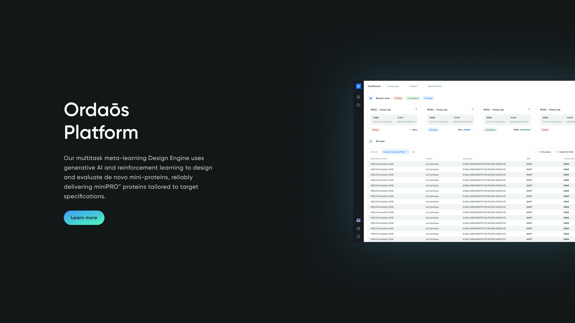
An AI biotech dashboard built by engineers, redesigned for the scientists actually using it — with a 12-color visualization system, a snapshot-and-drill-down view pattern, and a workspace hierarchy that mirrored how scientists already organize their work. Two audiences had to be served at once: scientists who needed density across multi-dimensional data, and investors evaluating the platform during demos and fundraising. The redesign made the dashboard feel like scientific software — one biologists could navigate the way they navigate their own data.
The challenge
By the time CPO Tim Shelburne brought me in, the app was running on a heavily customized Bootstrap-style design system that had been layered onto for years. Components were bulky. Error messages read like stack traces and made users question the system instead of trusting it. Loading states were opaque, so model runs felt stalled even when they weren't. None of it felt like the tools these scientists actually used day-to-day.
The product also had to serve two audiences at once: scientists making complex decisions across multi-dimensional data, and investors evaluating Ordaōs' AI capabilities during demos and fundraising. Scientists needed density. Investors needed clarity. The same screens had to do both.
Goals
Working with Tim, we framed the redesign around three needs:
- Make the data feel reliable, smart, and scientific. Errors should give scientists outlets for action, not reasons to doubt the platform. Loading and system feedback should communicate progress, not silence.
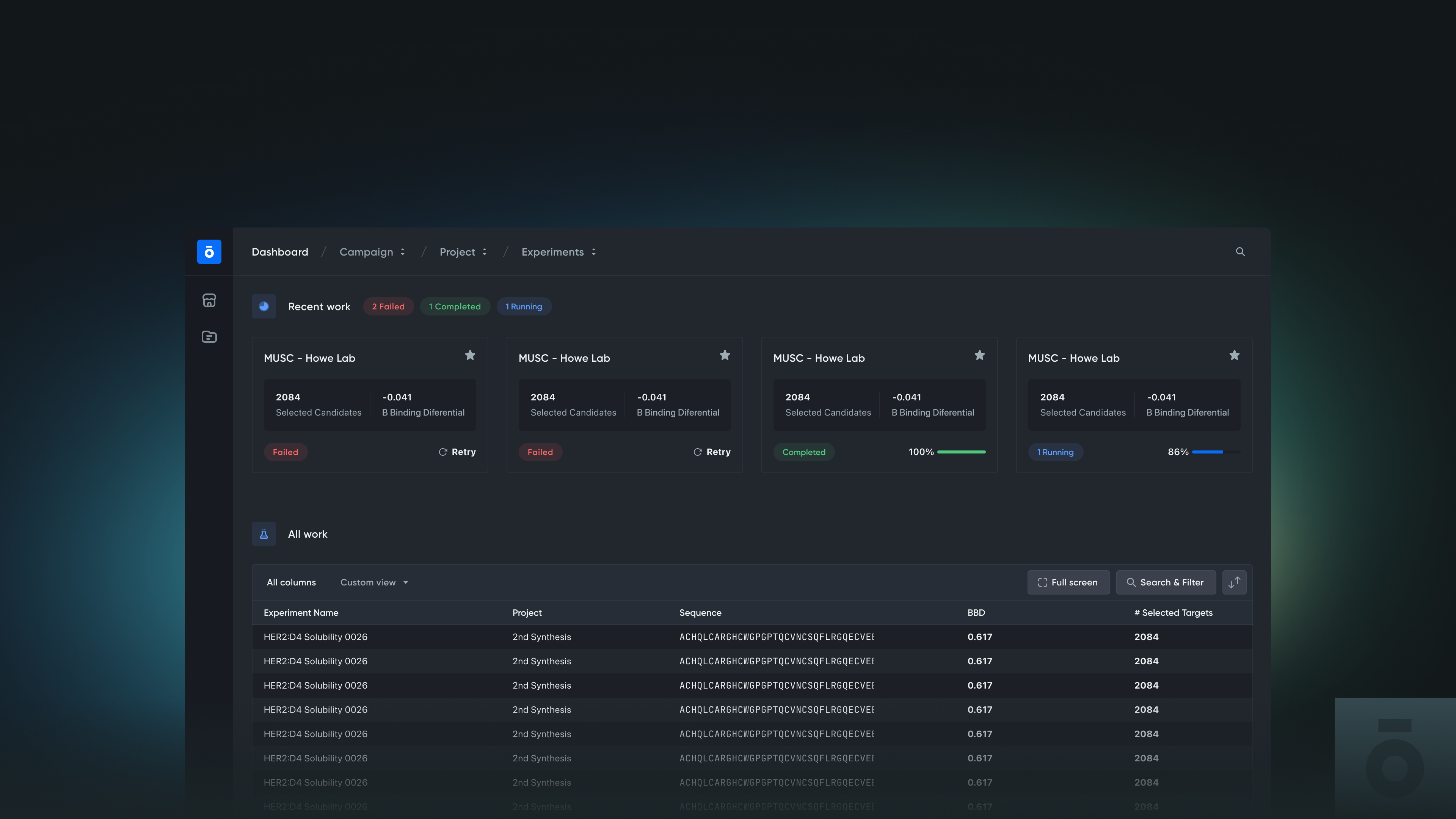
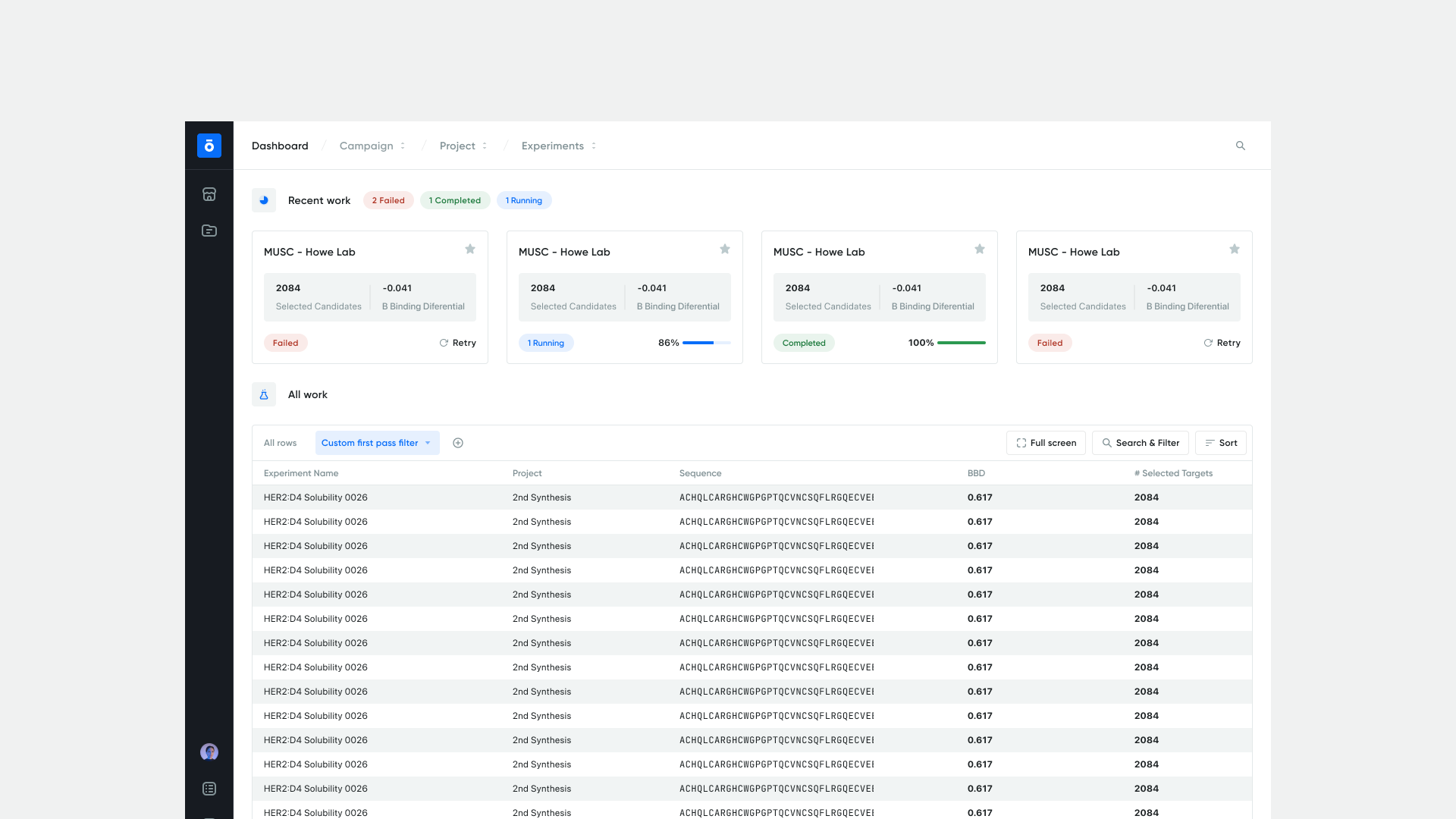
- Show data at the right granularity. AI runs generate enormous volumes of output — every model execution, every protein candidate. Scientists needed snapshot views to capture results at a glance and drill-downs to dig in when something warranted attention.
- Make the work findable. Each model run lived inside an experiment, inside a project, inside a pharma org running multiple projects in parallel. The app had to surface that hierarchy clearly so scientists could pick up where they left off, plan next runs, and layer new analyses across data they'd already generated. Discoverability becomes the product when the platform creates more data than anyone can manually track.
Approach
I structured the engagement into two lanes across a three-month timeline. The strategy: design the highest-impact views thoroughly, then hand engineering a system they could propagate across the rest of the product independently — critical views first, propagation second.
Lane 1 — Designing for scientists
Most of the work happened here. The process, in order:
- Started with a full dashboard audit. Without deep domain knowledge, I couldn't assume which problems were real problems — so I audited the whole product to align with the team on what actually mattered. The audit surfaced what color meant in this context, where data visualization was load-bearing, and which interactions were critical to scientists' workflows. You don't need to be a scientist to design for scientists; you need to bring them into the design process.
- Made dark mode part of the strategy. Working in this dashboard is closer to working in a spreadsheet than browsing a website — long, unblinking stretches looking at dense data. That's focus work, and dark mode was the right surface for the attention it demanded. Not decoration; a deliberate call about how the system should support the way it actually gets used.
- Dialed back branding in favor of system elements. System fonts over custom typefaces, system controls over bespoke ones. Under sustained focus, legibility and accessibility outrank visual flourish — and the platform reads as more trustworthy when it gets out of its own way.
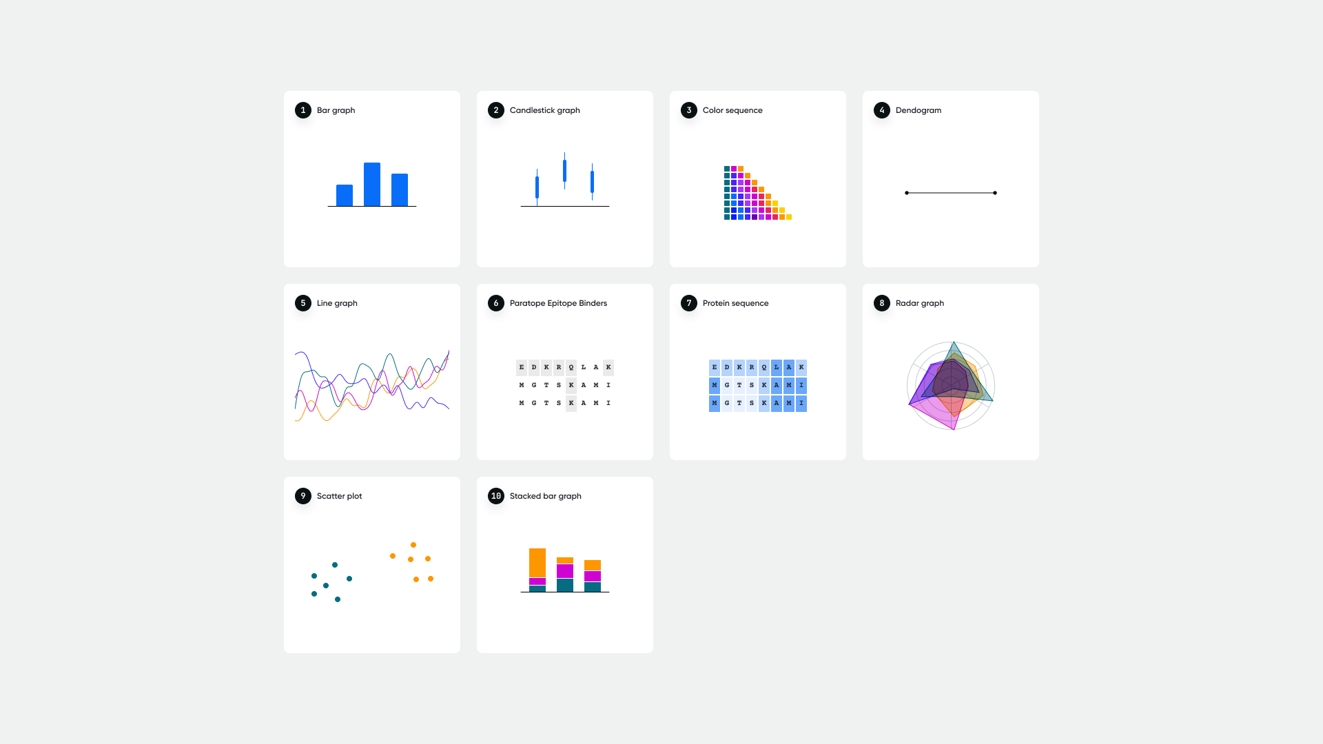
- Ran data-visualization exercises to find the right lever. Complex vs. simplified isn't a binary, it's a dial. I explored multiple points along it — a 12-color sequential system for full-density views, monochrome for clean comparisons, heat maps for trend recognition, contrast-intensity for accessibility. Different settings for different moments, instead of one palette pretending to fit everything.
Lane 2 — Designing for investors
The branding layer on top of the dashboard, plus a pro bono redesign of the marketing website — both intended to read as production-grade software during demos and fundraising conversations. The website redesign was scoped and designed end-to-end, but never made it to implementation; company priorities shifted after the engagement and it was shelved.
Key design decisions
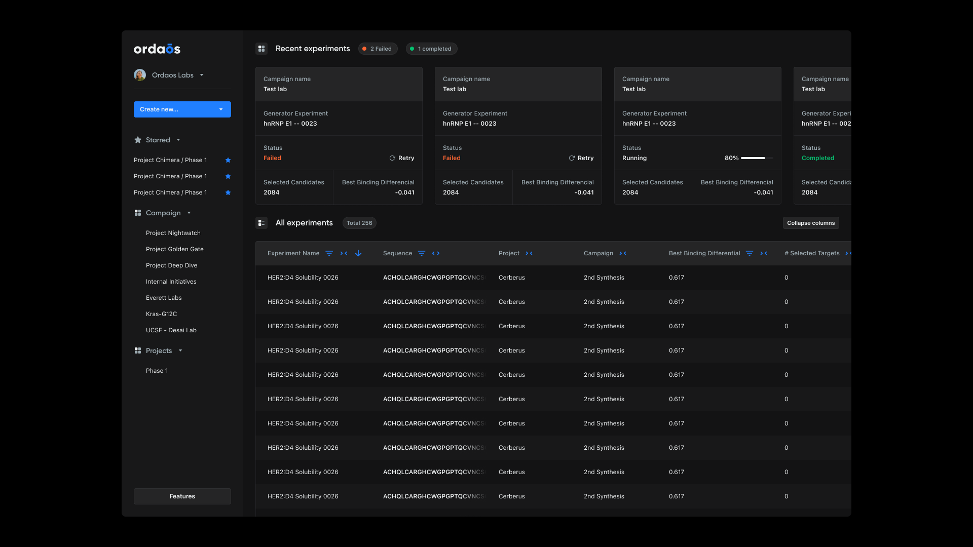
- Workspace hierarchy: project → experiment → run. Mirrored how scientists already organize their work, so the app reflected the mental model rather than imposing a new one. Picking up where you left off became the default state, not a workflow you had to reconstruct.
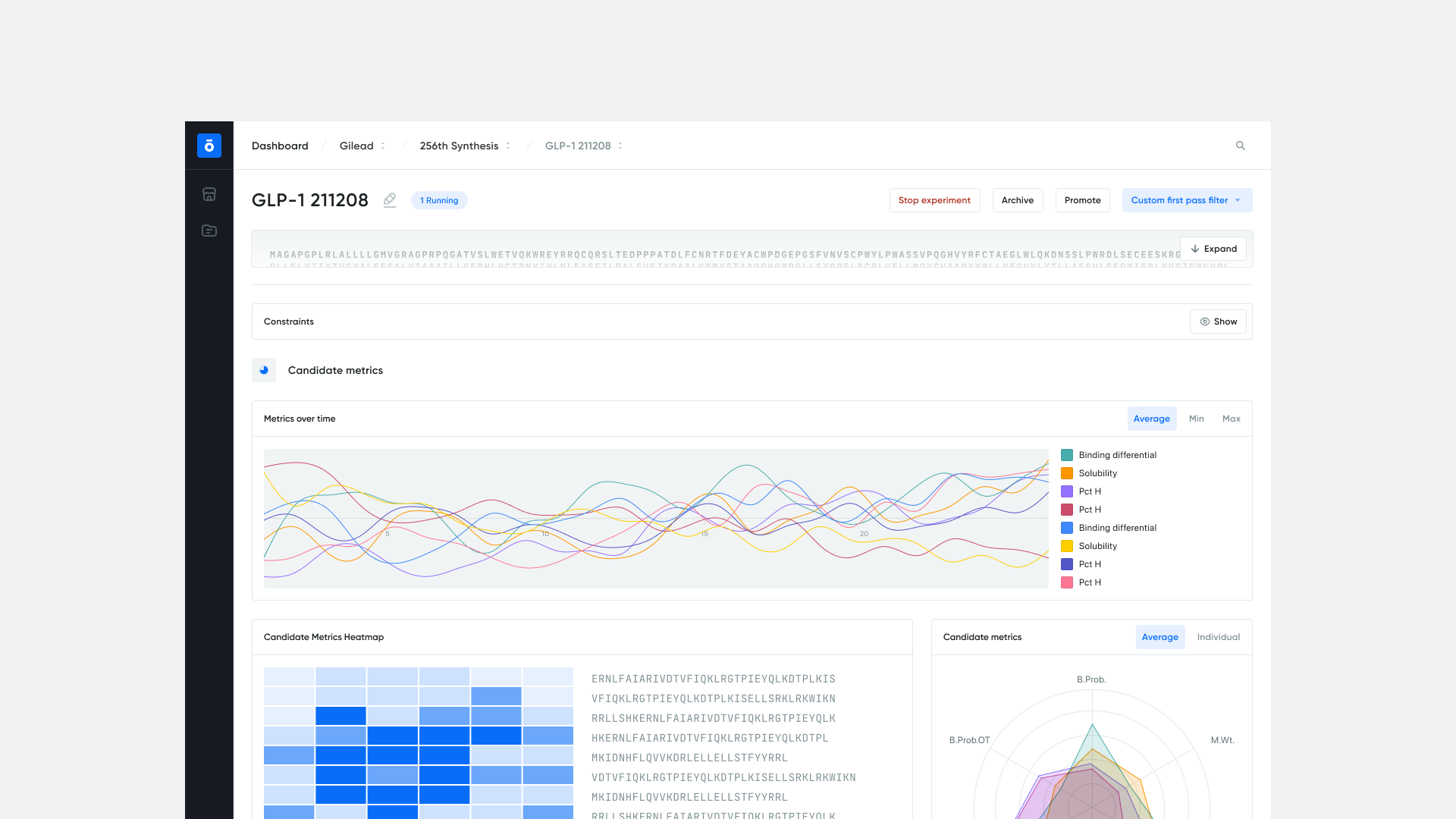
- Error and loading states as tools for action. Stack-trace-style errors got rewritten as actionable next steps. Loading states got progress signals tied to the work happening underneath — model run, not spinner. The system's voice shifted from something broke to here's where you are.
- Snapshot + drill-down as the default view pattern. Every dense view got a glanceable summary up top and a deeper layer one click away. Honors both ways scientists read data — quick scan and forensic dig — without forcing a choice.
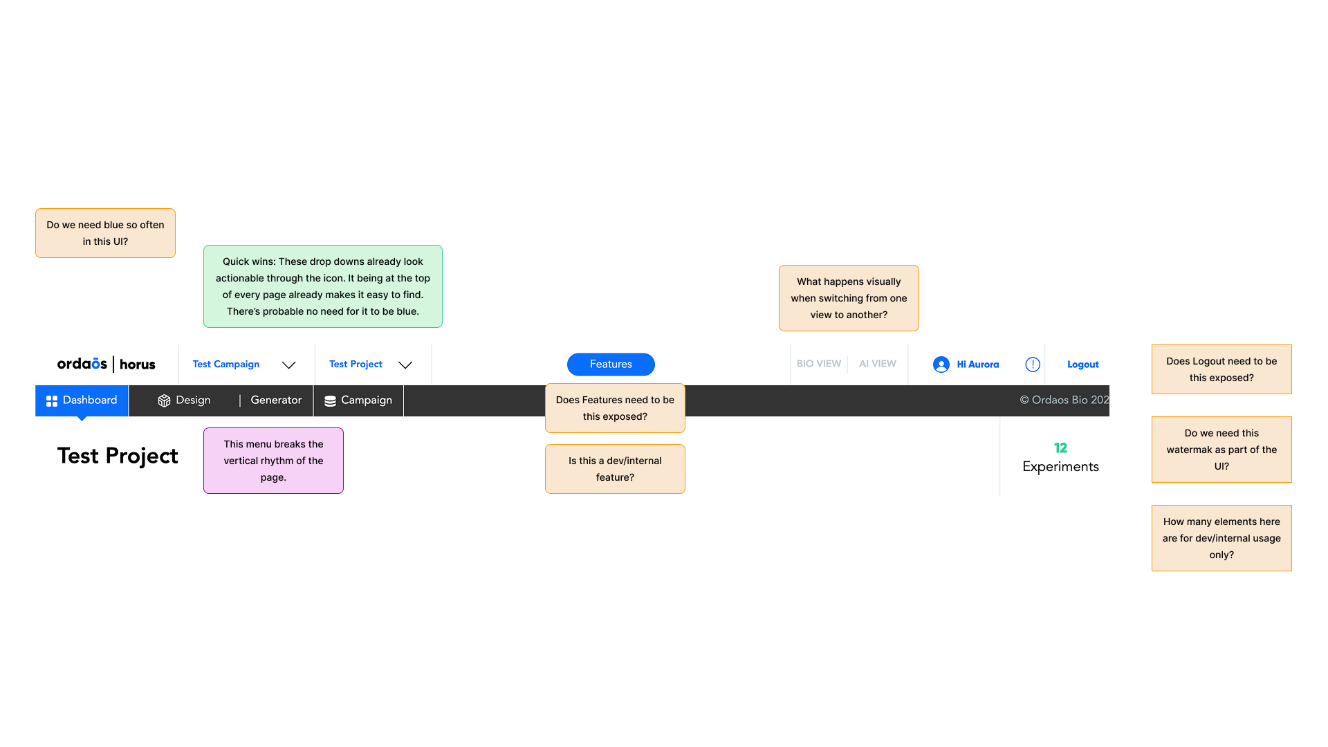
- Trade-off transparency in stakeholder reviews. I presented options with explicit trade-off analysis (data density vs. cognitive load, accessibility vs. visual richness) instead of prescribing a single answer. Made the decision-making visible so the team owned the calls alongside me.
Outcomes
The redesigned dashboard shipped with the deliverables and patterns the team needed to keep building beyond the engagement.
- Systematic visual language with the 12-color data-visualization system at the core.
- Custom iconography set tailored to scientific workflows.
- React-ready component specifications across the dashboard's primary views (project → experiment → run).
- Workspace hierarchy and snapshot-and-drill-down view patterns adopted as defaults.
- Audit findings and visual language structured so engineering could maintain and propagate the system independently after the three-month engagement closed.
The deeper outcome: a platform that stopped reading as engineer-built tooling and started reading as scientific software — one biologists can navigate the way they navigate their own data.
Reflection
The most useful insight from the engagement: you don't need to be a scientist to design for scientists; you need to bring them into the design process. Domain knowledge isn't a prerequisite for designing scientific software — what matters is structuring the audit, prototyping, and review steps so the people who do have it become co-authors of the work. The dual-audience framing held up across every decision; the moments it broke down were always when someone tried to optimize for one audience by removing what the other needed.
Credits
Solo design engagement in direct collaboration with CPO Tim Shelburne.