Dark Mode
Designing the color system and theming architecture that brought dark mode to 56M+ developers—and unlocked 8+ accessibility-focused themes.
Shipped dark mode at GitHub Universe 2020 to 56M+ developers — and the design token architecture underneath that now powers 6+ accessibility-focused themes across the platform. Dark mode sounds simple until you try to do it on a product where users set their own colors on things like issue labels and syntax highlights. The hardest design problem was figuring out what "sameness" means when you change every color in an interface and users still need to recognize their stuff. We built a token system heavy enough to control every edge case, assembled a team where each person's expertise was genuinely irreplaceable, and shipped flawlessly. The best (and most challenging) project I've been part of.
The challenge
Dark mode had been one of GitHub's most-requested features, and an accessibility need for the 56M+ developers on the platform. But it couldn't be solved with a CSS color inversion. GitHub needed a theming architecture: a design token system flexible enough to support multiple themes, handle WCAG contrast requirements across different color modes, and account for complex subsystems like user-chosen label colors, syntax highlighting, and empty state illustrations.
The problem space — dark mode couldn't be a simple color inversion
Goals
The work split into three concurrent goals:
- Build a theming architecture, not a theme. A token system that could support multiple themes — light, dark, high-contrast, colorblind variants — without each one being a one-off engineering effort.
- Hold the line on WCAG. Every theme had to meet contrast requirements across the entire product, including the subsystems where users inject their own colors.
- Ship without disruption. Dark mode launches at this scale rarely arrive cleanly. The bar was a flawless launch — no rollback, no follow-up bug burst, no community confusion.
Role and scope
- Dark mode look and feel — led the visual design exploration for the primary dark theme: saturation, lightness, tint, overall atmosphere.
- Color system architect — designed the functional variable (design token) system that made the entire product themeable.
- Collaboration lead — coordinated specialists across color palettes, subsystems design, product design, and engineering to ship a flawless launch.
Approach
It's not inverting the colors, it's dimming the lights
Switching themes should feel like the same space in different lighting. Every visual hierarchy, spatial relationship, and information architecture stays the same. This principle kept the system anchored even as we changed every color in the palette.
Systematic color audit and codification
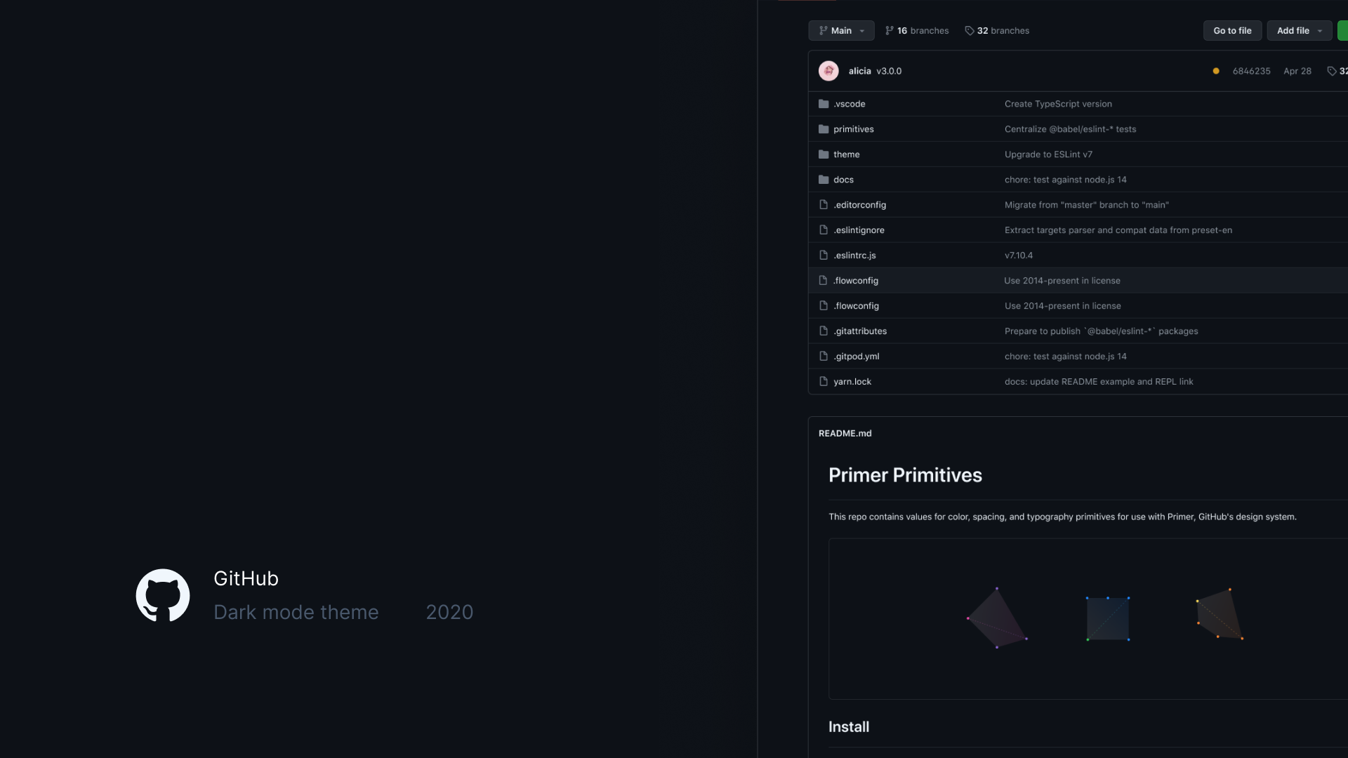
Conducted a comprehensive audit of every color value in production, uncovering massive inconsistencies outside of Primer. Grouped colors by intent, consolidated duplicates, and began creating semantic design tokens — color values renamed by function, not appearance, so the system was theme-agnostic from day one.
Auditing every color in production to uncover inconsistencies
Absolute control over elegance
Designed a functional variable system intentionally heavier than typical token architectures — trading minimalism for precision because the launch needed optimizing for coverage. Collaborated with Julius to redesign color scales with predictable contrast and luminance at each step, so step N in any hue always serves the same functional purpose.
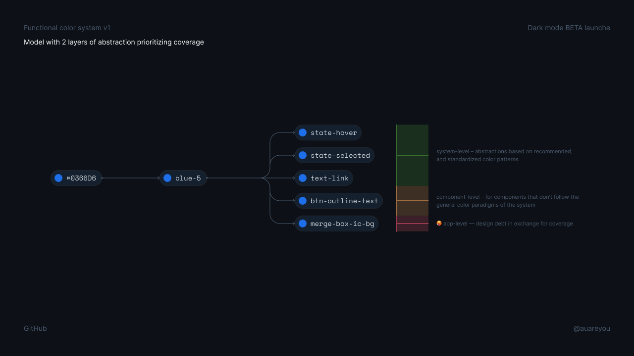
From raw hex to semantic tokens — two layers of abstraction
Subsystem-first problem-solving
The hardest problems weren't in the main design system but in subsystems: user-chosen label colors (ANY HEX VALUE AND ITS ACCESSIBLE FOREGROUND!), empty state illustrations, syntax highlighting, and theme settings UX. Design genius Javi Diaz developed perceptual color translation — approaches for moving user-chosen colors across themes while maintaining both WCAG contrast and perceptual consistency and led the product design for the theme settings interface — how users preview, select, and manage themes.
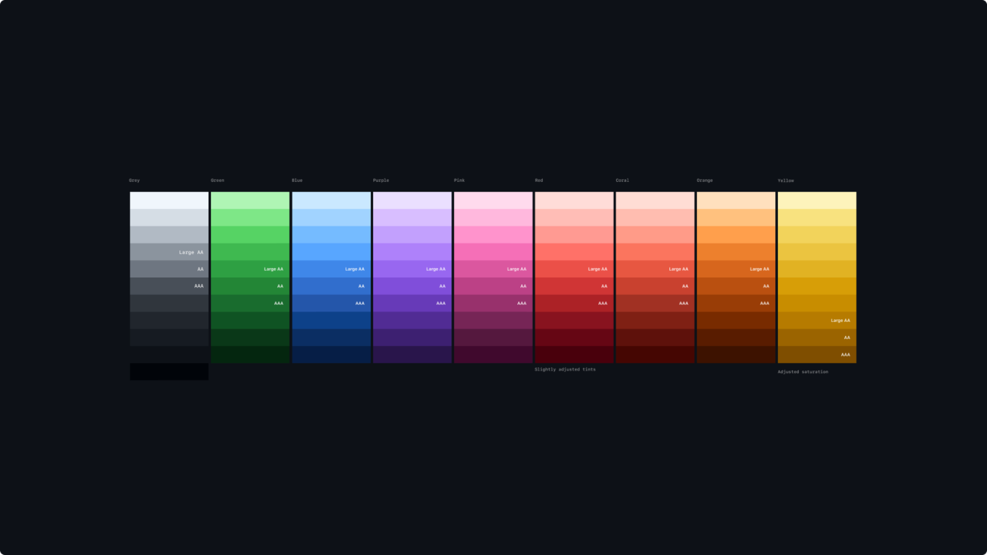
Semantic color scales with WCAG contrast levels baked in
Outcomes
Dark mode launched flawlessly at GitHub Universe 2020 to immediate, overwhelmingly positive community response.
- The functional variable system has evolved to a robust primitive system and now supports 6+ themes — including high-contrast and colorblind-friendly options — meeting WCAG 2.1 accessibility standards.
- Established the theming architecture that continues to scale GitHub's color mode system today.
- The launch drove immediate user adoption and sustained positive sentiment across the developer community.
- Color palette redesign became the foundation for all future color work at Primer, including Brand UI.
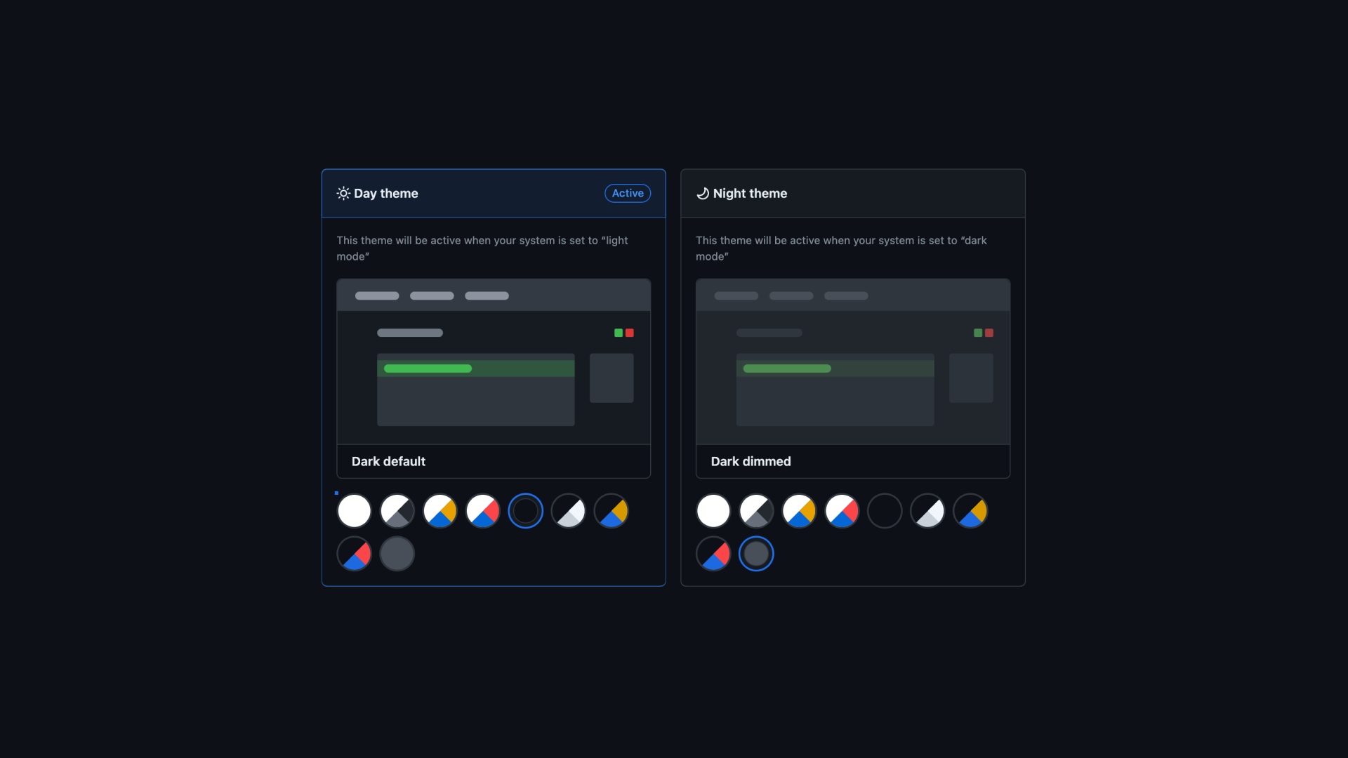
The theme settings UX — how users preview, select, and manage themes
Reflection
Infrastructure work pays compound interest — the component refresh enabled dark mode, which unlocked the full 6+ theme ecosystem. Constraint turns out to be harder than freedom: making something feel "the same" in a new visual context required deeper perceptual understanding than designing something new. And the deepest lesson was about collaboration — exceptional work came from assembling irreplaceable expertise, not from hierarchy. Every person on this team brought a unique superpower, and the launch was exemplary because we leaned into that asymmetry instead of flattening it.
Credits
Led under Diana Mounter (Design Infrastructure Director). Semantic color palettes by Julius Yanik. Theme settings and subsystems design by Javi Diaz. Engineering by Cole Bemis, Simon, Jon Rohan, and Colin Keany.