GitHub Redesign
A modern visual language for the world's leading developer platform, shipped without disrupting the workflows millions depend on daily.
As lead designer, I was responsible for the full visual refresh of GitHub's UI — shipped to 56M+ developers without workflow disruptions. We started from a single component (the primary button) and let it seed the entire visual language.
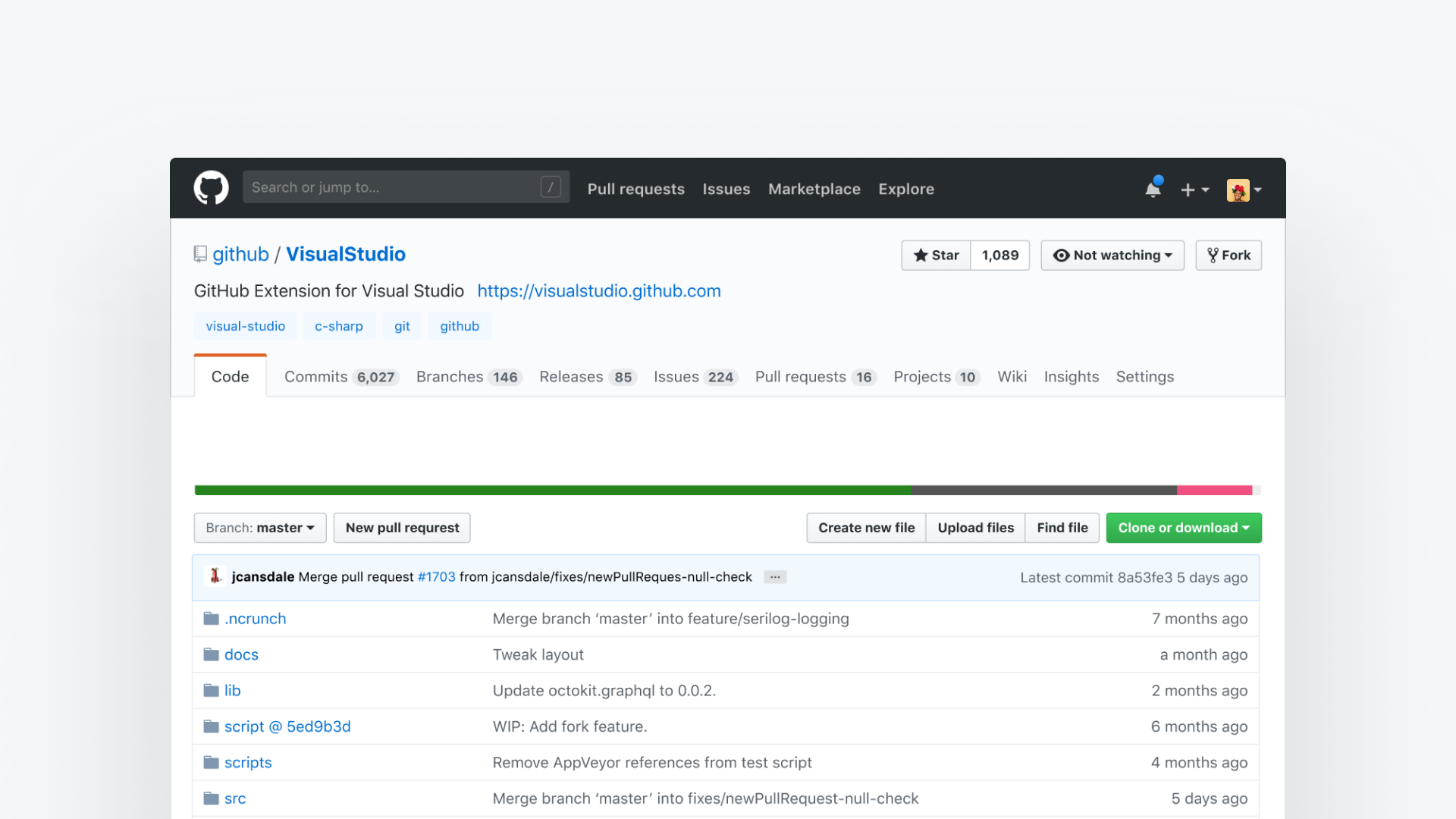
The starting point — years of accumulated visual patterns
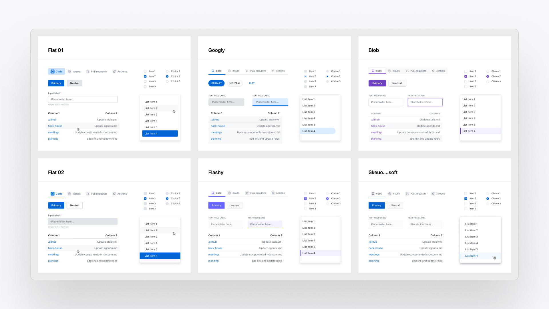
Divergent explorations — each direction had a name and personality
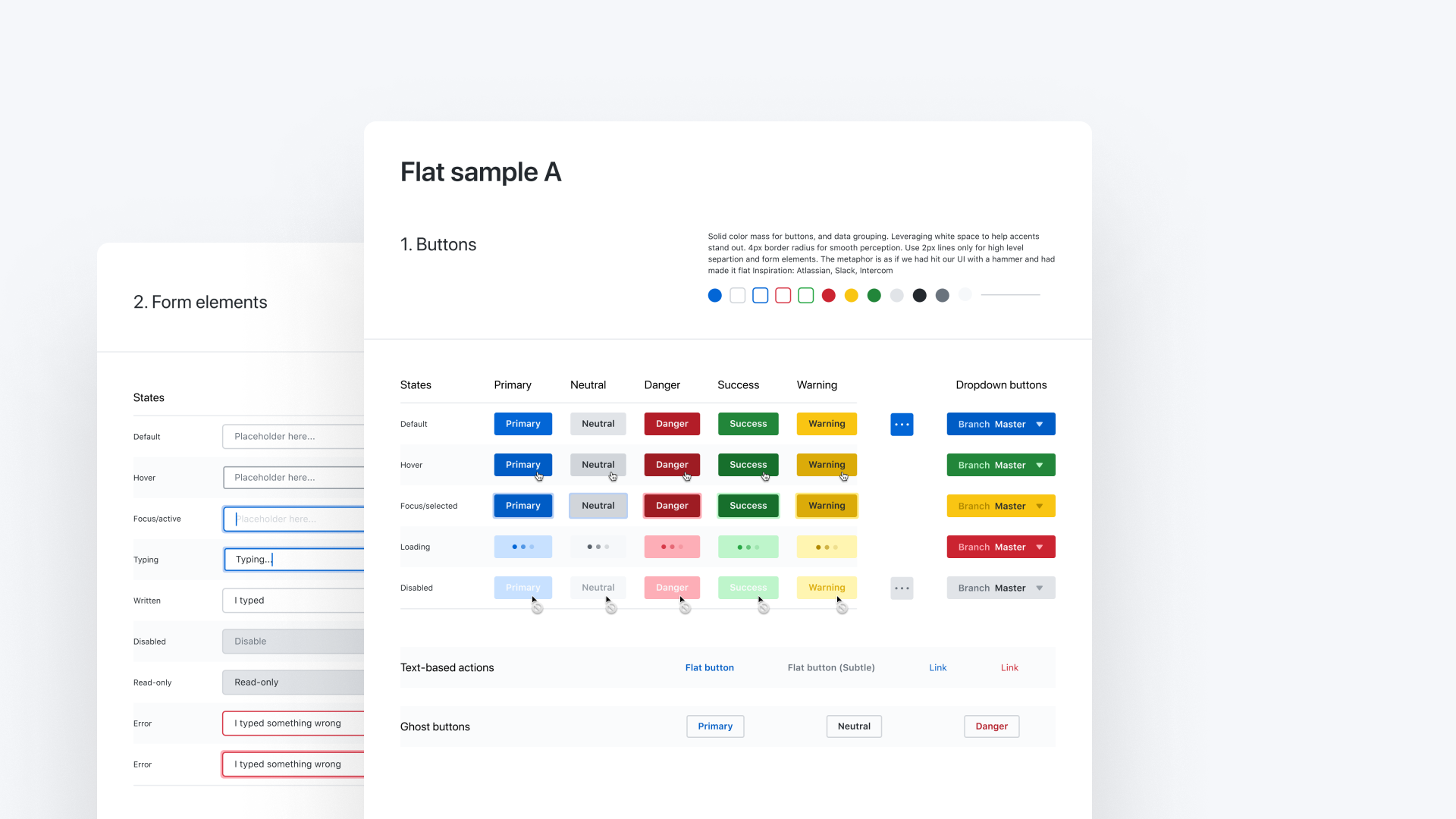
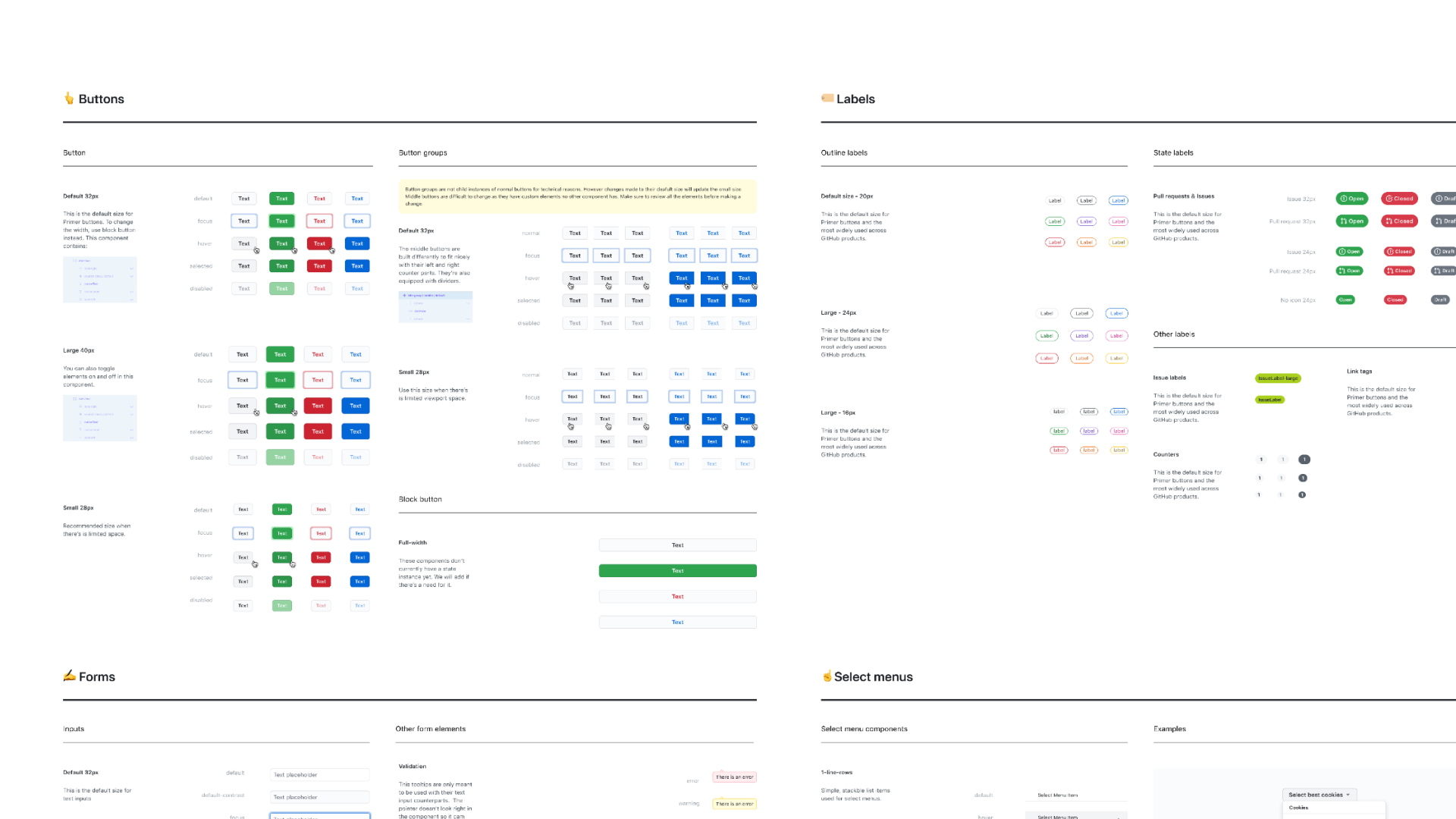
Using the primary button as a seed to derive the full visual language
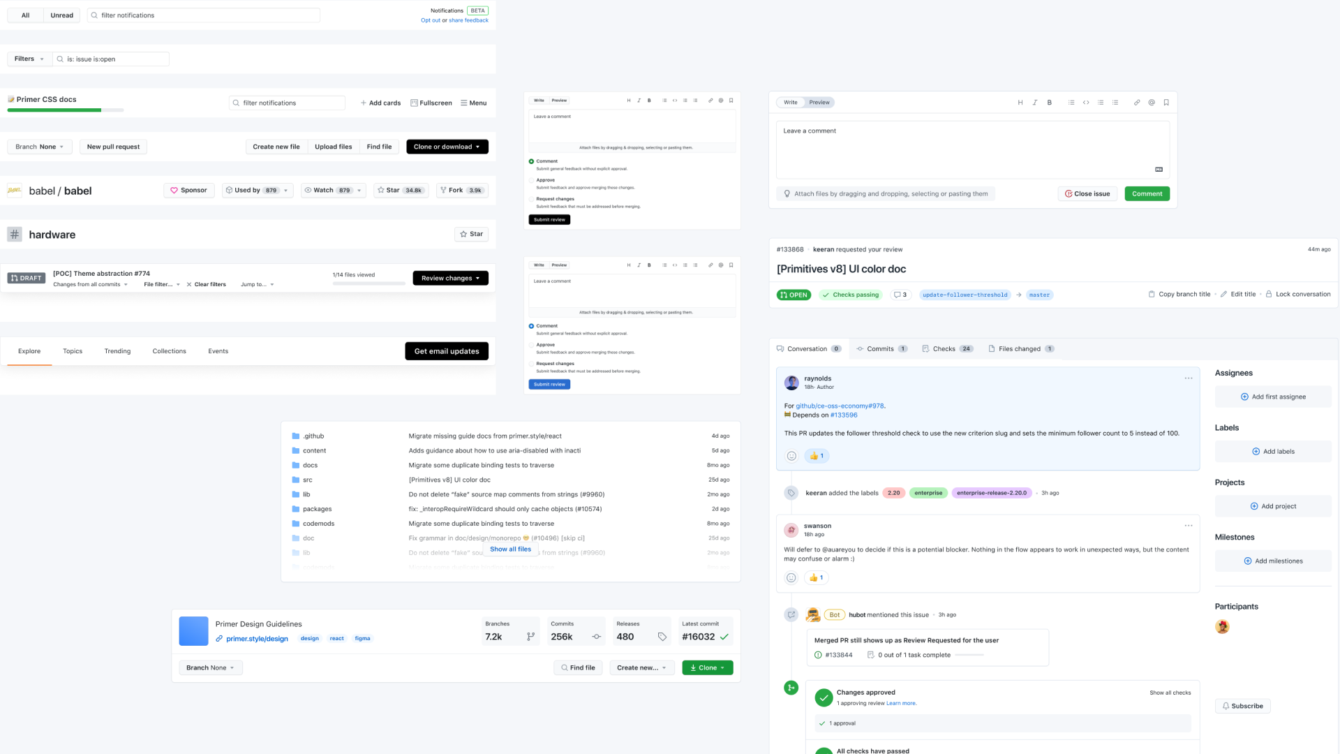
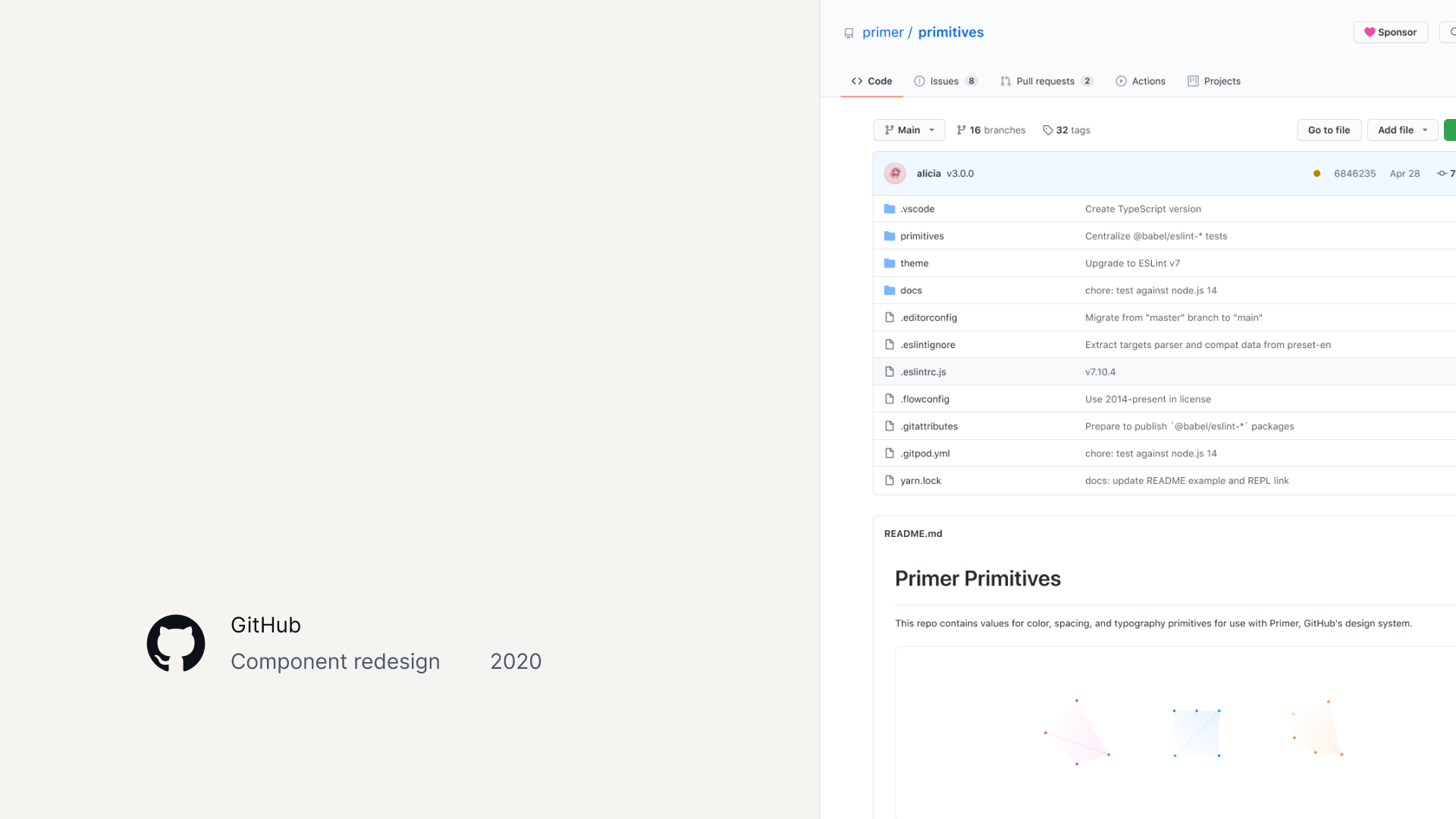
Open-source collaboration on the Primer design system
The challenge
GitHub — the world's leading developer platform, serving over 100M+ developers today — needed a modern visual language that could scale without disrupting the workflows millions depended on daily.
When the project begun in 2019, the existing UI was a blend of the Primer design system and years of unregulated patterns, creating visual inconsistency and significant design and technical debt across critical product surfaces.
Goals
The work split into three concurrent goals:
- Modernize without dating. A visual language that felt contemporary but wouldn't read as a trend in three years.
- Scale beyond a single team. Ship the system Figma-, React-, and ViewComponents (Ruby on Rails)–ready so product teams could adopt it without design infrastructure support on every project.
- Look new without breaking anything. Roll a noticeably refreshed visual language across live surfaces used by millions without disrupting a single workflow, layout, or interaction. The product had to feel new on the surface and identical underneath.
- Coordinate with the iconography (Octicons) and repository page redesigns already underway, and ship them together as a single visual refresh.
Role and scope
- Lead Designer — responsible for the tactical design work: research, exploration, prototyping, component design, and visual QA.
- Systems Maintainer — updated the Figma component library, assisted adoption across product teams, and coordinated engineering dependencies.
Approach
Stealth launch strategy
Every change shipped behind feature flags, tested with real users before broader rollout. We redesigned a live product used by millions without disrupting their workflow — and shipped without an announcement, monitoring community channels for the reaction. When nobody notices a redesign, the visual continuity is the success metric.
Divergent exploration with structured convergence
I created multiple visual explorations with named vibes (including competitive analysis exercises like "What if GitHub were Figma?") and presented stakeholders three strategic lanes: practical MVP, aspirational north star, and recommended direction. The three-lane framework transformed binary feedback into nuanced direction-setting.
Expressive visual language
We named it SkeuoSoft. A subtle dimensional aesthetic — soft shadows, intentional depth, warmth — that gave components tactile presence without feeling dated. This became Primer's new visual identity.
Context-based color strategy
When I started, I'd assumed we'd change the primary button to blue — "green is a status color." But as feedback came in and I learned more about GitHub's history, I realized that convention didn't apply here. GitHub users valued familiarity and expressivity. It was a really good lesson.
Outcomes
Visual refresh launched by June 2020 across all three Primer implementations: Figma, React, and ViewComponents.
- A big step towards the consolidations of years of fragmented, unregulated design patterns into a cohesive component system covering critical product surfaces (repo views, PRs, issues, settings).
- Directly enabled the dark mode project that followed by unifying color usage and increasing Primer coverage across the product.
- Community reaction validated the approach: developers noted the improvement in tone, but no workflow disruption complaints surfaced — the stealth launch worked.
Reflection
There's always plenty I'd do differently after a project. Here, I'd take the time and resources I had for blue-sky explorations and push them much further — especially with the tools we have now. I'd bring in brand leadership earlier and invest in conversations about vision. What I loved was learning that conventions can be context-relative rather than absolute, and seeing how high-level business strategy trickles down into small tactical design decisions.
Credits
Led under Diana Mounter (Design Infrastructure director) and Max Schoening (VP of Product Design). Design collaboration with Ash Guillaume and Emily Hiller. Engineering partnership with Cole Bemis, Jon Rohan, Colin Keany, and Simon. This was deeply collaborative work — every decision shaped by conversation and shared ambition.