GitHub Redesign
A modern visual language for the world's leading developer platform, shipped without disrupting the workflows millions depend on daily.
I led the visual redesign of GitHub's core UI components for 73M+ developers. We started from a single element (the primary button) and used it to derive an entire visual language. The challenge was to redesign that modernizes without disrupting is harder than one that announces itself.
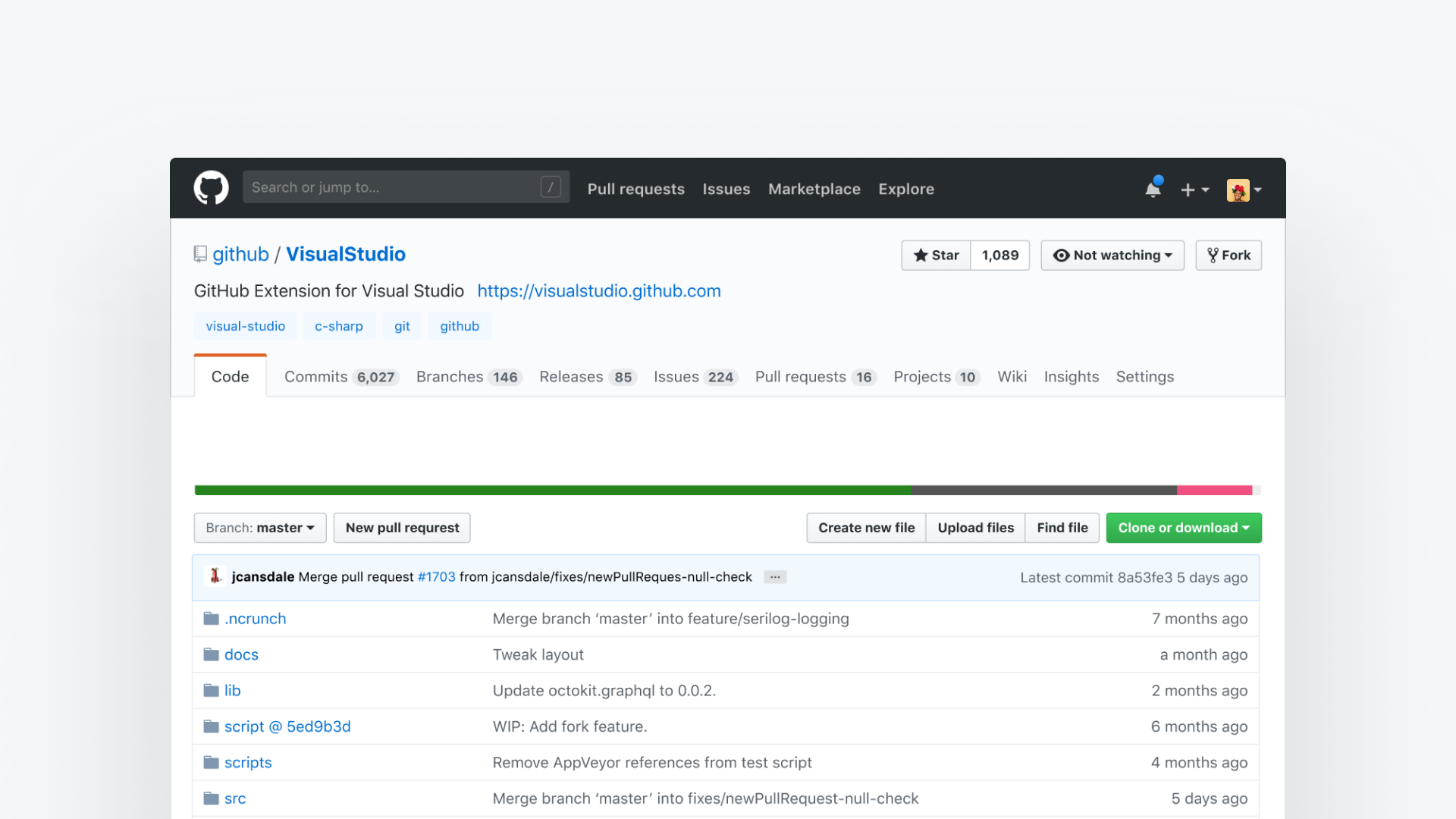
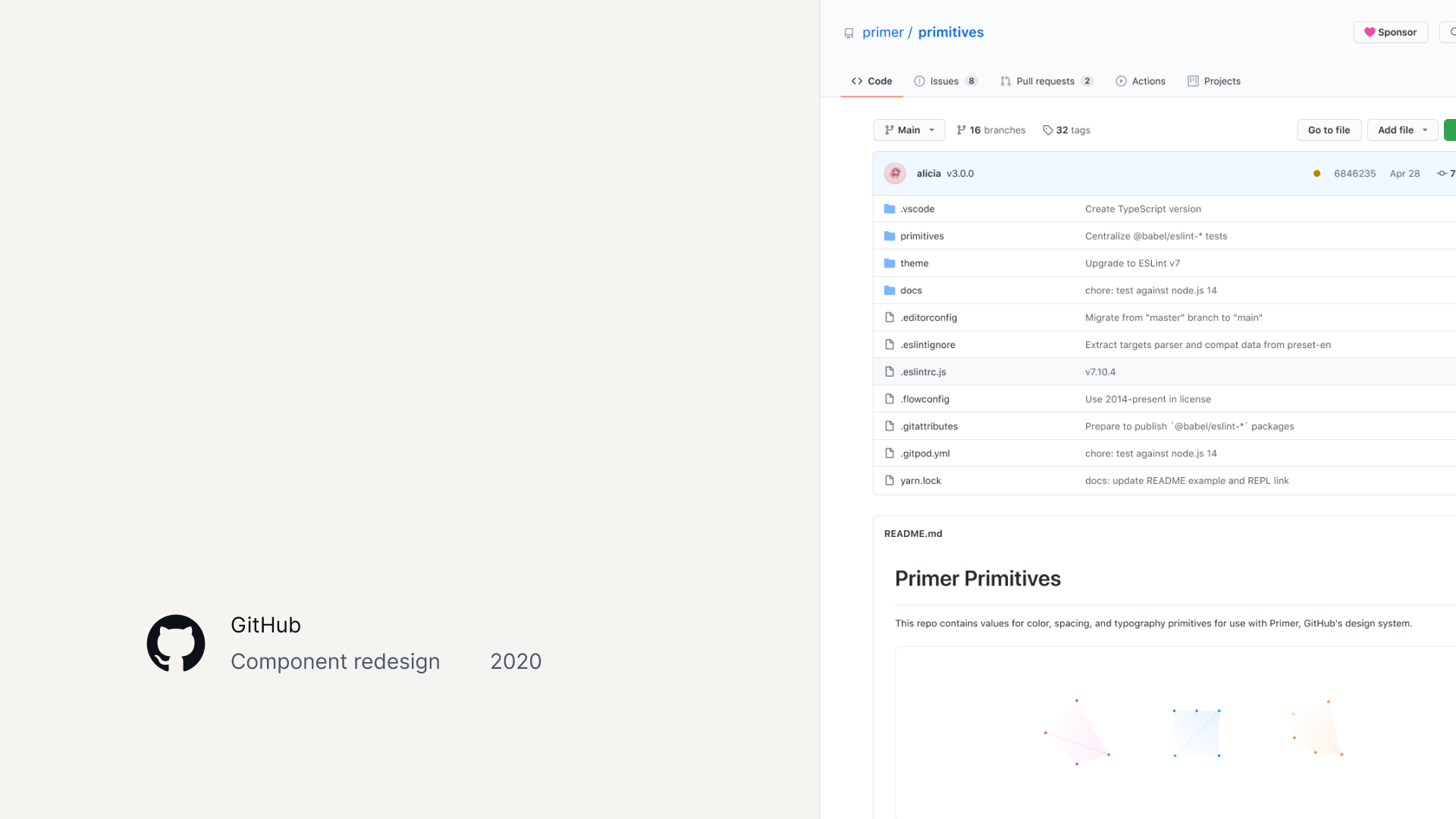
The starting point — years of accumulated visual patterns
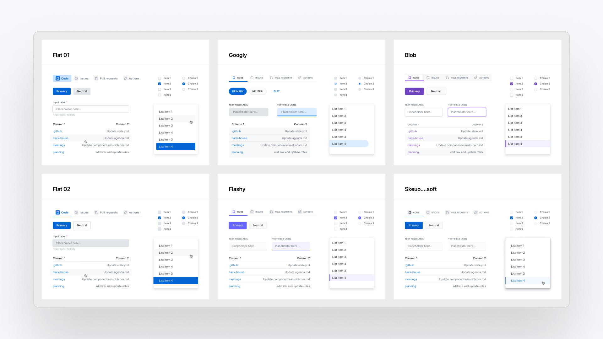
Divergent explorations — each direction had a name and personality
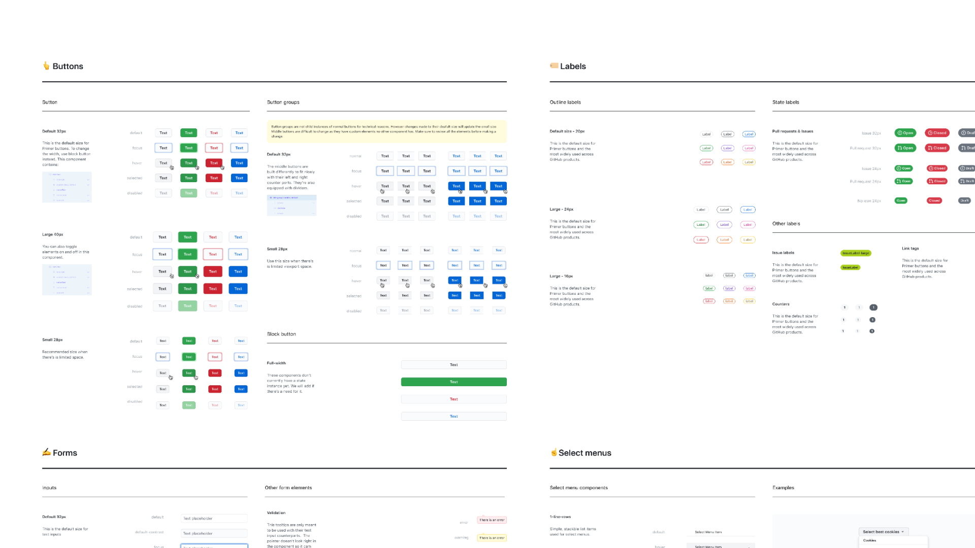
Using the primary button as a seed to derive the full visual language
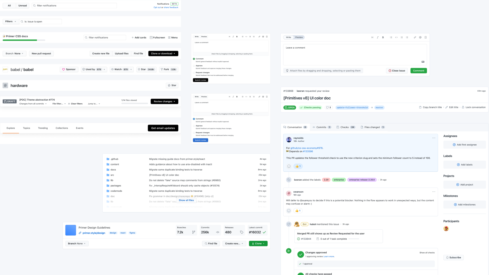
Open-source collaboration on the Primer design system
The Challenge
Modernize without disruption
GitHub—the world's leading developer platform serving over 73 million developers—needed a modern visual language that could scale without disrupting the workflows millions of people depended on daily.
The existing UI was a blend of the Primer design system and years of unregulated patterns, creating visual inconsistency and significant design and technical debt across critical product surfaces.
Design principles from first principles
We used the primary button as a seed component—because it contains the DNA of a visual language (color, radius, shadow, typography, iconography). Getting this one element right informed every other component systematically.
Divergent exploration with structured convergence
I created multiple visual explorations with named vibes (including competitive analysis exercises like "What if GitHub were Figma?") and presented stakeholders three strategic lanes: practical MVP, aspirational north star, and recommended direction.
Role & Scope
- Lead Designer—responsible for all tactical design work: research, exploration, prototyping, component design, and visual QA
- Systems Maintainer—updated the Figma component library, drove adoption across product teams, coordinated engineering dependencies, and authored documentation
Approach & Methodology
Design principles, Divergent Explorations, and Incremental Delivery
Key Design Decisions
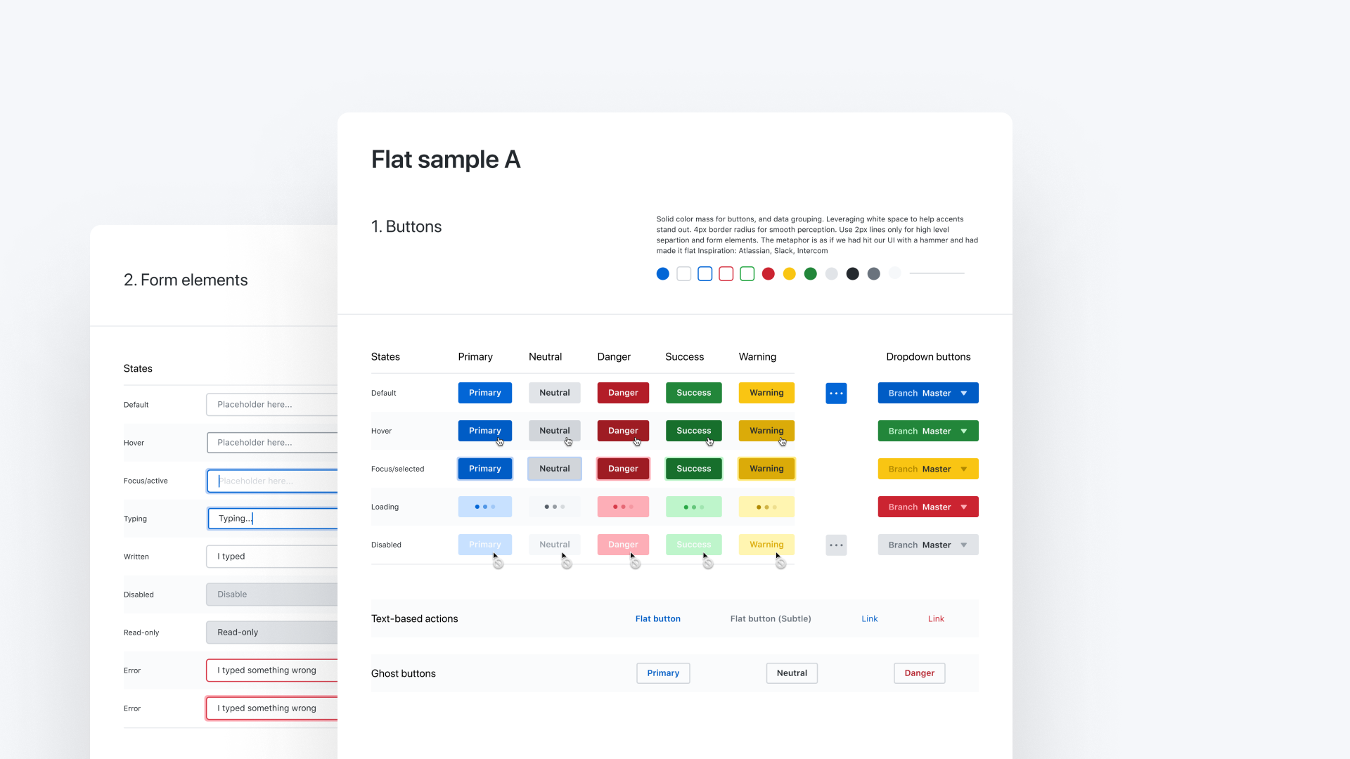
SkeuoSoft
Incremental delivery with progressive rollout
Every change shipped behind feature flags and beta programs, tested with real users before broader rollout. We redesigned a live product used by millions without disrupting their workflow.
SkeuoSoft visual language
Designed a subtle dimensional aesthetic—soft shadows, intentional depth, warmth—that gave components tactile presence without feeling dated. This became Primer's new visual identity.
Evidence-based color strategy
Challenged my own assumption that blue was the safest primary color through user research. Validated that the green/status concern I'd designed around wasn't a problem users experienced, saving significant design iteration.
Stealth launch strategy
Shipped without announcement and monitored community channels. When nobody notices a redesign, the visual continuity is the success metric.
Outcomes
Visual Refresh Launched by June 2020
- Shipped a full visual refresh across Figma, React, and ViewComponents (Ruby on Rails) implementations of Primer—GitHub's open-source design system
- Directly enabled the dark mode project by unifying color usage and increasing Primer coverage across critical product surfaces
- Consolidated years of fragmented, unregulated design patterns into a cohesive, scalable component system
- Redesigned Octicons, GitHub's open-source icon library, as part of the visual refresh
- Community reaction validated the approach: users noted the improvement without feeling disrupted
That Was Then, This Is Now
The design philosophy holds—divergent exploration, shared visual language, incremental delivery. But AI transforms the timeline and tooling.
I'd run creative explorations using AI to generate UI variations in hours instead of days, audit color usage and component patterns programmatically instead of manually recreating screens, and use custom tools like my Design System Restyler to let stakeholders interact directly with expressivity options.
As building custom tools becomes more affordable, I'd prototype a few different ideas and figure out which one integrates most seamlessly into my workflow and is intuitive enough for stakeholders to use directly.
Lessons Learned
- Design in context, never in isolation—components on a blank canvas lie to you. Test in real product surfaces early.
- The three-lane framework (practical / north star / recommendation) transforms stakeholder conversations from binary feedback into nuanced direction-setting
- Challenge your assumptions by asking questions, not by designing around them—user research is faster than speculative design iteration
- Strategic incrementalism requires—and builds—organizational trust. Shipping carefully is part of the design work.
Credits
Led under Diana Mounter (Design Infrastructure director) and Max Schoening (VP of Product Design). Design collaboration with Ash Guillaume and Emily Hiller. Engineering partnership with Cole Bemis, Jon Rohan, Colin Keany, and Simon. This was deeply collaborative work—every decision shaped by conversation and shared ambition.